A great website is easy to use and delivers what users are looking for. In the 2000s and 2010s, a great website for a credit union was an attraction, but in the 2020s, it’s a necessity. Today, 71% of Americans access their financial accounts using a website or mobile app.
An exceptional website has many different qualities and features, but the best credit union websites have several in common: online banking, personalized content, great customer service, mobile optimization, good accessibility, and an eye for user experience (UX) design.
They Feature Online Banking
The first online banking predates Web 2.0, the dot-com bubble, and even the prevalence of home computers. In 1980, United American Bank became the first financial institution to offer online banking. For $25-30 a month (and the purchase of a specially-made security modem), customers could gain access to their account balance, budget and tax calculators, and even the ability to submit loan applications online.
United American Bank’s online banking system was short-lived as the bank went under just 3 years later for unrelated reasons. However, their first-of-its-kind online tool paved the way for future generations of financial institutions.
Today, the best credit union websites offer online banking access that goes far above and beyond United American Bank’s early attempts. Online banking platforms still offer the ability to check account balances and submit loan applications (for certain loan products) but with enhanced features like the ability to turn off suspected stolen cards, transfer funds between accounts, set up new bank accounts, and other self-servicing options. Instead of purchasing proprietary hardware and paying a monthly subscription, most credit unions offer online banking for a marginal fee or for free via web applications that work on any device.
Focus on Online Banking: St. Jean’s Credit Union
St. Jean’s Credit Union features a friendly website with many of the features from this list on display. However, one button leaps out from the page: their big green online banking login button. Since this is what many members come to the website for, St. Jean’s made it easy to find, which is why a bright color in a prominent position is the perfect choice.
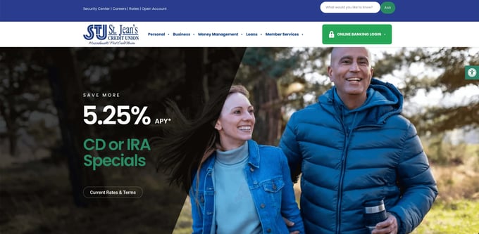
(St. Jean's Credit Union)
They Offer Personalized Content
According to BCG (Boston Consulting Group), “Personalization in banking is not primarily about selling. It’s about providing service, information, and advice, often on a daily basis or even several times a day.” The challenge for credit unions is to transform data into actionable ways to provide personalized service, information, and advice.
In a survey by the same organization, 37% of customers (the largest segment of responses) said they want to interact with their financial institution similarly to how they interact with Amazon: they know what they need in general terms. Still, they are open to automated suggestions when they’re relevant.
In practical terms, personalization can range from the very simple (like recommending new accounts based on member activity) to the very complex (like building customized products around the specific needs of an individual member). Personalized credit union websites can suggest new products, provide helpful tips, suggest resources based on needs, and call members by name.
They Have Robust Customer Service Options
Through personalization, credit unions can recommend resources to help members with specific tasks, but this is just the tip of the iceberg.
1. Self-Servicing Options
Some members prefer to talk to a representative over the phone, but for members using your website, user-friendly self-servicing options can help. These could include basic how-to and FAQ resources or more sophisticated controls over their account. For example, giving members the ability to shut off a card they suspect is stolen directly from your website helps to relieve the burden on your customer service team.
2. Customer Service Chats
When members have needs that go beyond self-servicing, a chat function on your website can provide extra support. About 41% of customers say they prefer live chat to other forms of communication, so while phone and email remain popular alternatives, most members prefer to get customer service help from your website rather than another channel. For further automation, AI-powered chatbots can replace some of the human workload on your customer service team.
3. Value-Added Services
It’s easy to forget that customer service is about more than just resolving member problems as they occur – customer service should also be proactive in setting members up for success. Your credit union’s website should attract members by offering value-added resources like webinars, blog posts, and videos.
Self-Servicing Spotlight: America First Credit Union
America First Credit Union features many self-servicing options, like the ability to open new accounts, enroll in online banking, and search their library of resources all in bright orange on the first page of their home page. Further down on the page, they offer answers to member questions like “I need a new car, where do I start?”
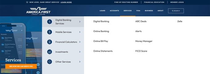
(America First Credit Union)
They’re Optimized for Mobile
Just three decades after the first commercial smartphones hit the market, mobile devices now account for 61% of all online searches. At least 96% of internet users own a smartphone, compared to just 63% that own a laptop or desktop PC.
Today’s internet users expect seamless compatibility between the desktop and mobile versions of your website. Members should be able to access the same information and tools from each site, and they shouldn’t have too much trouble finding what they’re looking for.
A clean user interface (UI) and strong visual hierarchy can make it easier for users to navigate between different versions of your site.
Making the Most of Mobile: Black Hills Federal Credit Union
Black Hills Federal Credit Union understands the value of mobile optimization. Not only is their website mobile-compatible, but they offer extensive resources for members like money management, credit monitoring, and savings calculators that are all optimized for mobile.
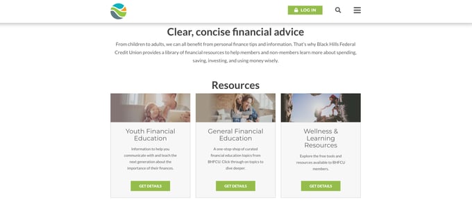
(Black Hills Federal Credit Union)
They Prioritize Accessibility
The goal of any credit union website is to make it easier for more people to access their services. However, when websites aren’t accessible, they end up creating barriers that make it harder for members (or potential members) to find information.
It’s vitally important for websites to be accessible to all users. Accessibility isn’t an afterthought – it should be part of every design decision. Some simple ways credit unions can increase the accessibility of their websites are:
1. Use High-Contrast Text
Of the top 1 million web pages, a staggering 86% used low-contrast text. Despite being one of the easiest and most consistent ways to make websites more accessible, it’s the most common accessibility error.
2. Provide Flexible Customer Support Options
Having a website with online banking is already an accessibility win. When members need support, give them flexible options that fit their needs. For example, one member may find it easier to use the chat function to contact customer service, while another may prefer to learn how to fix the issue themselves through a self-service option.
3. Use Good Formatting
As a rule of thumb, only use one <h1> per page, avoid unusual or experimental typesettings that may be difficult to read, and always label form fields.
Accessibility Advocates: University Credit Union
University Credit Union uses several best practices on its website, including pausable animations and high-contrast text. That’s because they follow the Web Content Accessibility Guidelines published by W3C.

(University Credit Union)
They Focus on User Experience (UX) Design
In gallery art, “good design” can mean “design that is good to look at,” but in practical applications like websites and online banking, “good design” more often means “design that feels good to experience.”
The user experience (UX) is the core of your website. When members enjoy their stay, they’re more likely to stick around. In fact, companies that invest in user experience see a 42% improvement in retention on average.
A website with good UX design will have an intuitive, user-friendly interface. That means navigation components like search bars, home buttons, and hamburger menus should be where users expect them to be. If users can easily navigate your site, they can gain more value from the resources you offer, make more use of your services, and won’t dread coming back in the future.
Design Highlight: Embers Credit Union
Behind the scenes of its eye-catching website, Embers Credit Union uses smart design to focus viewers’ attention. By highlighting a few elements on the screen rather than overwhelming the viewer with visual information, Embers Credit Union draws viewers’ eyes to the top right, where an eggplant-purple button invites viewers to open an account against an amber backdrop.
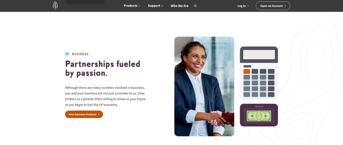
(Embers Credit Union)
Putting It Together: What Makes a Great Website?
In 2021, there were 1.8 billion websites on the web. Standing out among 1.8 billion competitors isn’t easy, but the best credit union websites help us identify some winning trends.
A great website must include online banking, the central feature of a credit union’s website. The website should also include customer service resources like self-servicing features or live chats. The website should be accessible to everyone, on any device, and users should be able to intuitively navigate it.
What it boils down to is this: your website must be easy to use and deliver on what your members expect. While rising consumer expectations are a challenge credit unions must overcome, these time-tested principles and stunning examples guide the way.

Related Posts: